The Handwriting of Scottish Charters 1100-1250 in the National Library of Scotland
Feature Article 5: Tessa Webber
The Models of Authority project encompasses a period remarkable for the emergence of an extraordinary level of diversity in the appearance of the handwriting of charters issued both north and south of the Scottish border. The earliest surviving Scottish charters, which date from the early twelfth century, reflect the long-established Anglo-Saxon tradition of writing such documents in a script no different from that used for formal handwriting in books. Over the course of the twelfth century, however, two very different kinds of stimuli prompted scribes to introduce a number of modifications to their handwriting when they wrote documents. These modifications came to be combined in various different ways, resulting in the diversity that characterises the handwriting of English and Scottish charters by the first half of the thirteenth century.
One stimulus was a desire to write with greater economy of effort: for example, by introducing simplified forms of certain letters as variants, or using fewer pen-lifts, or paying less attention to matters of detail. The other was a desire to introduce features of style observed in the more elaborate handwriting of continental documents (such as those issued by the papacy) and which came to be regarded as especially appropriate for formal documents that conveyed grants of property or privilege. These two stimuli might at first sight appear to be incompatible, but much of the diversity in the handwriting of documents that emerged during this period was the product of scribes experimenting with the graphic potential of combining elements of rapid writing with elements of style, or adopting as new features of style modifications of the cursive traces originally unintentionally recorded on the parchment as the pen moved rapidly from one stroke to the next.
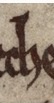
By the second half of the twelfth century, a common perception had emerged in Scotland, as in England, that the handwriting of documents should differ from that of books, but the degree and character of difference could vary and be achieved in different ways. The Models of Authority project will enable palaeographical analysis of more than six hundred of of the original Scottish charters that survive from between 1100 and 1250. In this piece, I have chosen to focus on a small subset of these, the corpus of digitized charters from the National Library of Scotland, in order to exemplify some of the various ways in which scribes modified their handwriting when writing documents over the course of this period.
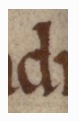
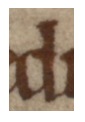
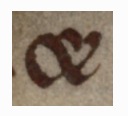
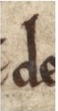
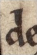
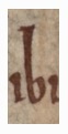
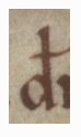
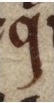
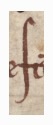
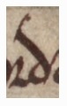
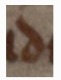
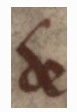
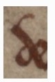
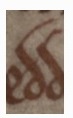
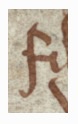
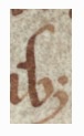
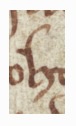
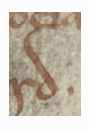
During the second half of the twelfth century, scribes trained within a tradition of formal bookhand within the institutional framework of a religious house might introduce only minor modifications into their handwriting when writing a charter. In some instances, the only modification might be the occasional replacement of the more complex ‘et’ ligature & with the more simply constructed 7-shaped abbreviation symbol for ‘et’, or d with a straight shaft with the simpler variant formed with an oblique shaft (the latter not requiring the careful perpendicular alignment of the former).
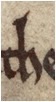
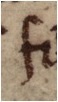
See, for example, NLS Adv. MS 15.1.18, no. 21:
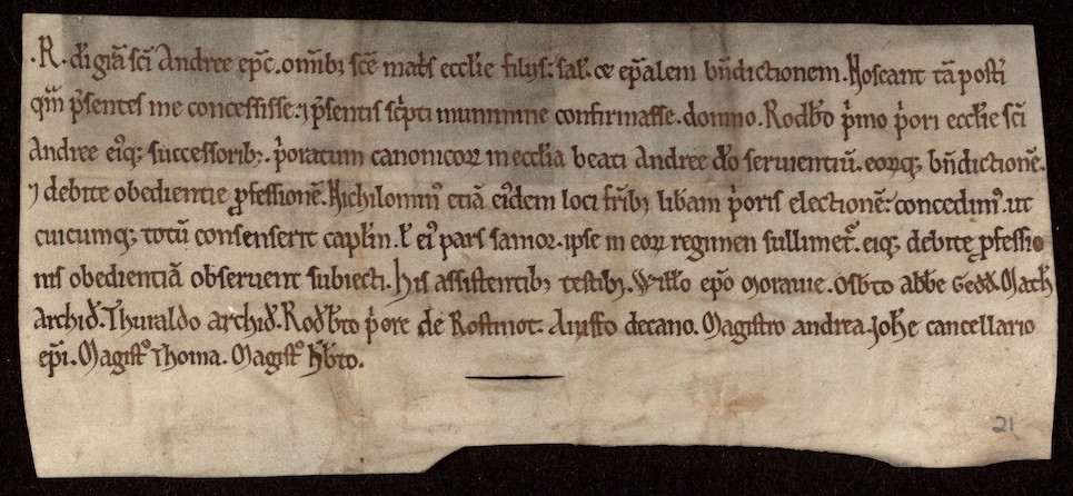
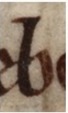
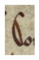
The examples below are from NLS Adv. MS 15.1.18, no. 21 and show d with a straight shaft and its simplified variant, & and the 7-shaped abbreviation symbol:
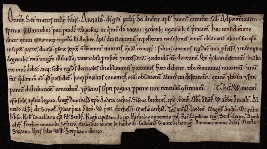
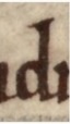
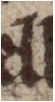
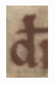
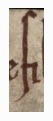
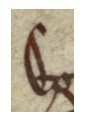
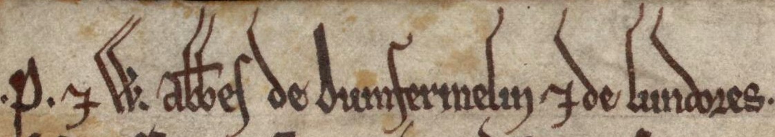
See also the variation in d found in NLS Adv. MS 15.1.18, no. 12:


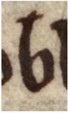
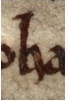
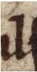
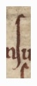
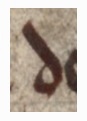
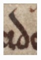
And the & and the 7-shaped abbreviation symbols from NLS Adv. MS 15.1.18, no. 81:

![]()
![]()

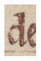
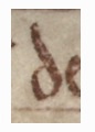
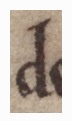
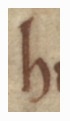
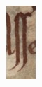
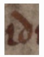
Scribes might, in addition, introduce features of style from continental traditions of documentary handwriting, such as the elongation of the ascenders of letters such as b, d, h and l.
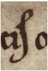
See, for example, NLS Adv. MS 15.1.18, no. 10:
The examples below show the elongation of the ascenders of b, d, h and l in NLS Adv. MS 15.1.18, no. 10:


![]()


![]()


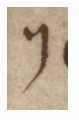
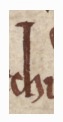
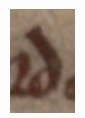
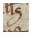
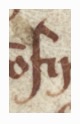
Another feature of style we see from continental traditions of documentary handwriting is the stylised treatment of elements of certain letters that descended below the baseline (such as f, s, q and sometimes also r and elongated i). Examples of this can be seen in NLS Adv. MS 15.1.18, no. 10:
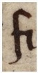
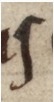
![]()
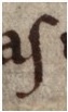
![]()
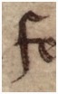
See also f, s and r in NLS Adv. MS 15.1.18, no. 22:
![]()

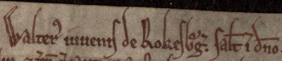
And r in NLS Adv. MS 15.1.18, no. 71:

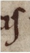
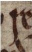
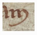
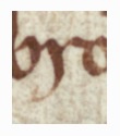
By the second half of the twelfth century, scribes who were practised in writing in a more informal fashion (usually employing a narrower nib-width in relation to the overall size of the script and making fuller use of variant or modified forms that could be traced more rapidly) also sought to give their handwriting a more elegant appearance by incorporating some of these same features of style. The scribe of NLS, Adv. MS 15.1.18, no. 11, for example, combined simplified variant forms and more informally-traced elements (such as the shafts of f, r and long-s formed as descenders of somewhat variable length, rather than finished neatly on the base-line) with a feature of style: the extended ascenders of b, d, h and l:
Example letter-forms from NLS Adv. MS 15.1.18, no. 11:
![]()


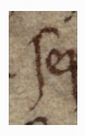


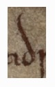


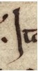
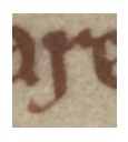
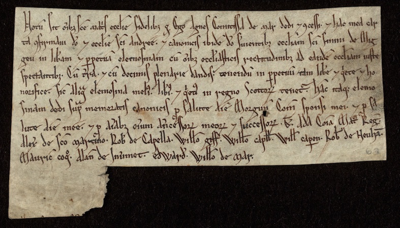
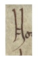
Scribes also experimented with economical ways of elaborating the appearance of majuscule letters, tracing one or more additional strokes roughly parallel to one or more elements of the letter, such as in the N, E and C of ‘Notum’, ‘Ego’ and ‘Comitissa’ in NLS, Adv. MS 15.1.18, no 62:
The appearance of such handwriting may itself have provided models or sources of inspiration for other scribes to imitate, with different degrees of formality of execution. The scribe of NLS, Adv. MS 15.1.18, nos 33 and 47 employed all of these simplified variant forms and new features of style whilst writing with a relatively broad nib and formal manner of execution, as well as introducing his own experiments with features of style, by embellishing the ascenders of the first line of both charters with oblique approach strokes, and sometimes applying such strokes to the oblique shafts of d elsewhere in the documents.
See NLS Adv. MS 15.1.18, no. 33:
And NLS Adv. MS 15.1.18, no. 47:
Detail of the embellished ascenders from the first line of NLS Adv. MS 15.1.18, no. 33:
Detail of the embellished ascenders from the first line of NLS Adv. MS 15.1.18, no. 47:
Examples of d both without and with embellished strokes in NLS Adv. MS 15.1.18, no. 33:


Examples of d both without and with embellished strokes in NLS Adv. MS 15.1.18, no. 47:
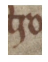
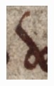
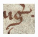
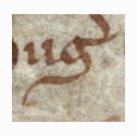
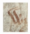
Rapidly executed handwriting could introduce clockwise and anti-clockwise loops within and between letters as the movement of the pen between strokes might be recorded on the page. Some of these these originally spontaneous traces could themselves become treated as features of style. The scribe of NLS, Adv. MS 15.1.18, no. 1 exploited for stylistic effect the traces recorded by clockwise rotatory movements involved in forming letters below the baseline (the extended final strokes of h, m, n and round s, and the descenders of f, s and r), and used the same movement to create an approach stroke to form the left-to-right broad stroke forming the main element of the lower part of the letter g:

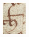
![]()

![]()
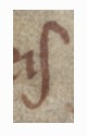
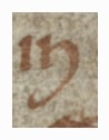
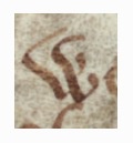
Likewise, the scribe recorded the final part of an anti-clockwise rotatory movement as a curving approach stroke to the vertical ascenders of b, h and l and the backward leaning oblique strokes of d, v-shaped u and w:

![]()


Ultimately the process of experimentation and interaction between these two tendencies: cursivity (the recording on the page of the movement of the pen between strokes, usually as a consequence of writing more rapidly) and a concern for style, and scribal imitation of the models provided by such experiments, led to the emergence of a new fully cursive script, with certain letters differing in their basic construction from the twelfth-century minuscule. NLS Adv. MS 15.1.18, no. 45 – a charter of 1283 that falls outside the chronological parameters of this project – provides an example of the fully-developed cursive script:


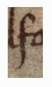
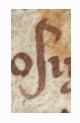
By 1250 some scribes had already incorporated many of the distinctive letter forms and features of style of this new script into their handwriting, alongside letter forms that subsequently were abandoned. The scribe of NLS Adv. MS 15.1.18, no. 16, for example, employed the cursive form of round s typical of the new script but not the small 8-shaped form of g, instead incorporating as part of the lower element of the letter a conspicuous broad, almost horizontal, stroke, traced from left to right:


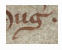
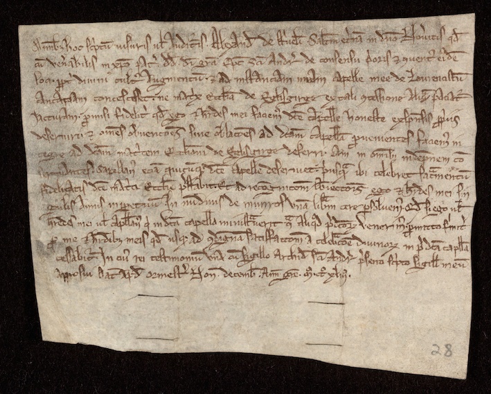
The scribe of NLS Adv. MS 15.1.18, no. 28 made ample use of the swelling and tapering strokes that are a conspicuous feature of style in the new script (forming, for example, the oblique shaft of d and the horizontal common mark of abbreviation), but not the more compact form of cursive round s or the small 8-shaped g:


It is one of the aims of the Models of Authority project to trace these developments in Scotland and to understand why they took place. How far did they parallel such developments in England, or did English precedent act as a source of inspiration? To what extent did the handwriting of royal charters provide an image of authority that was imitated in other contexts, or was the handwriting of the official acts of ecclesiastical authorities a more important source of influence? The charters from the National Library of Scotland are on their own too small a sample to answer such questions, but the different choices made by scribes that contribute to the variety of their appearance demonstrate that charters were written artefacts that were intended to be seen as well as read and their contents heard, and therefore that the visual appearance of what was written was itself a matter of significance.
Comments